The new Charts+ and enhanced Formula Feature in Tables deliver a seamless, intuitive experience, enabling users to visualize, configure, and analyze data effortlessly within a streamlined workflow. With expanded access to diverse data sources and powerful comparative tools, users can explore key metrics, refine their analysis in real-time, and unlock deeper insights to drive performance and medical decision-making.
Intelligence Platform
Self-Service Reporting in iP: Intelligence Platform
SHARE
Transcript
I’m thrilled to present the latest advancements to our reporting and visualization capabilities in the Intelligence Platform with Charts+ and Formula Feature in Tables.
Recent improvements enhance reporting and visualization.
A user experience that is intuitive, easy, and makes setting up your report seamless and quick.
The ability to group data in different ways, enabling more comparative analysis.
Expansive access to diverse data types, datasets, and calculation capabilities.
Charts+ enhancements in the Intelligence Platform enables users to effortlessly configure and analyze data through intuitive visualization tools.
By adding widgets within the analysis area, users can create various chart types, such as value charts and x y charts, to explore key metrics.
With a wide range of available data sources, including metric data, session activity, and medical data, users can compare key metrics.
The flexibility of Charts+ allows users to preview and refine their analysis in real time without switching screens.
This streamlined workflow enhances efficiency in evaluating performance, coaching insights, and medical assessments.
By offering a comprehensive yet user friendly approach to data visualization, Charts+ empowers users to gain deeper insights and make informed decisions based on comparative data, whether analyzing individual performance against peers or broader team trends.
The formula feature in the comparison table lets users perform new calculations leveraging configurable, out of the box formulas, including percentage and percentage baseline change, empowering relative and comparative analysis.
We look forward to sharing additional enhancements and innovations.
Please reach out to your Kitman Labs representative with any questions on how to start putting these capabilities to work for you today.
RELATED VIDEOS
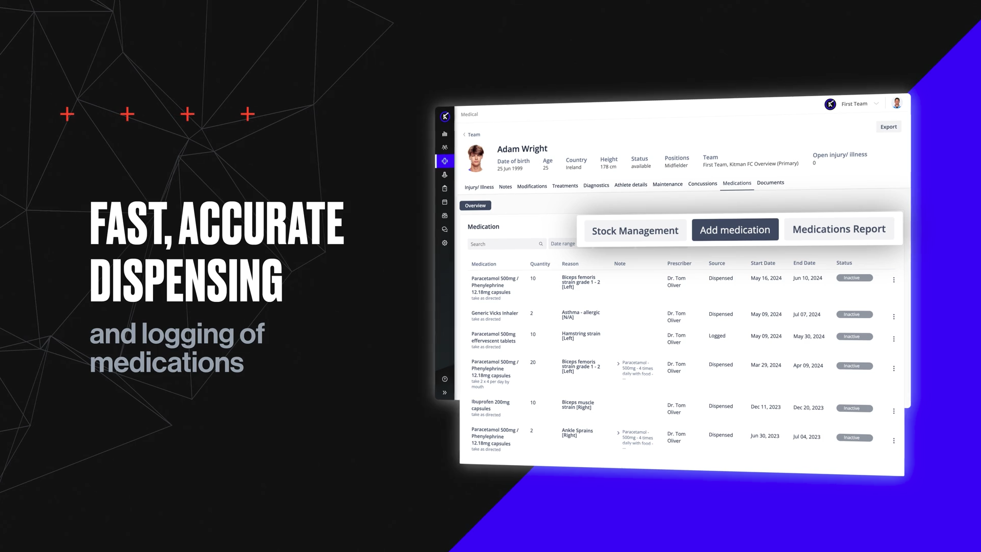
Performance Medicine – Medication and Stock Management
Medication and Stock Management centralizes the tracking, logging, and dispensing of medications while integrating with athlete medical data, ensuring compliance, accuracy, and enhancing transparency. Practitioners gain real-time access to medication histories, stock levels, and medical alerts, streamlining workflows and supporting safer, more informed care decisions.
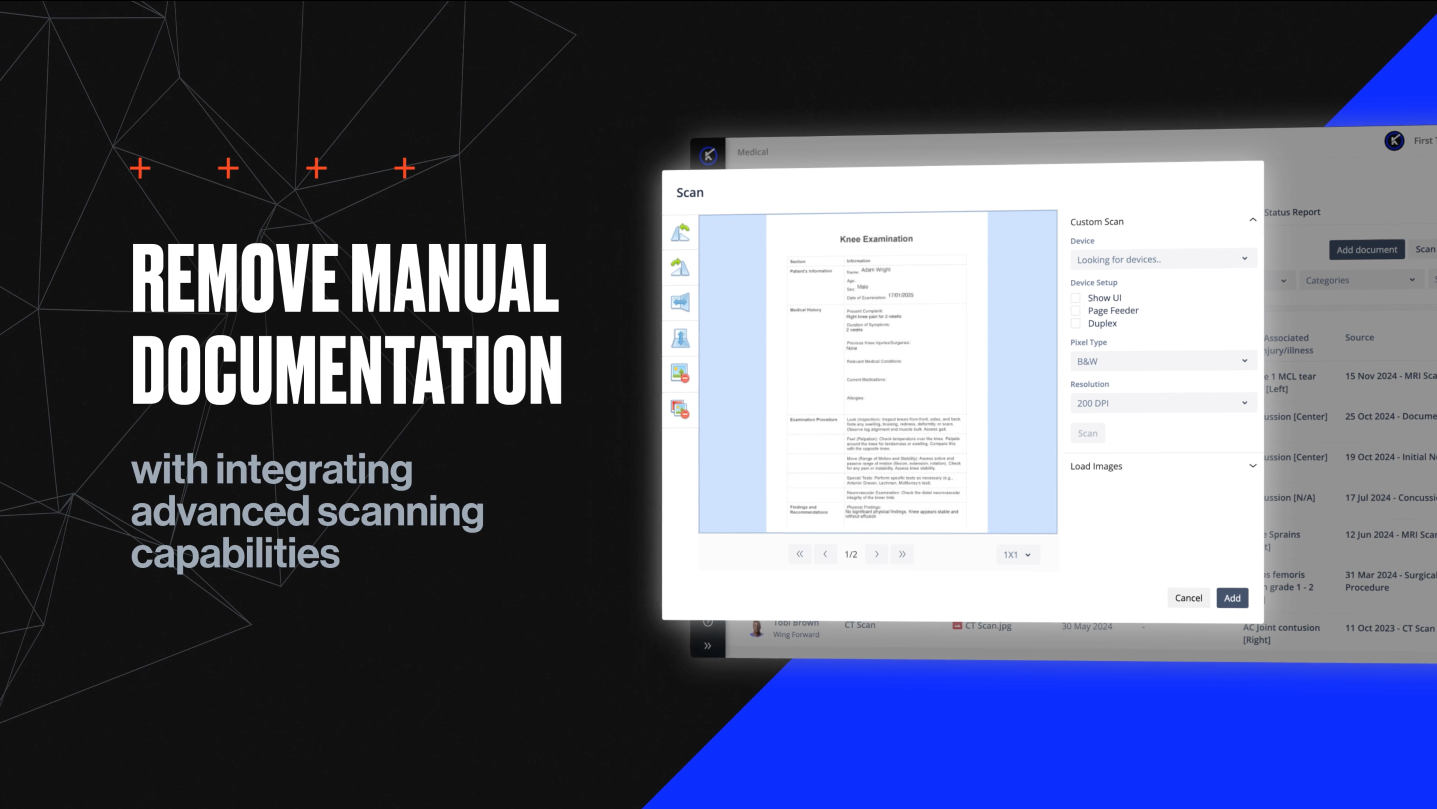
Performance Medicine – Mass Scan
Mass Scan in the Performance Medicine Solution automates bulk scanning, splitting, and assignment of medical documents, centralizing records for streamlined organization and quick access. This enhances compliance, reduces administrative workload, and allows practitioners to focus more on player care
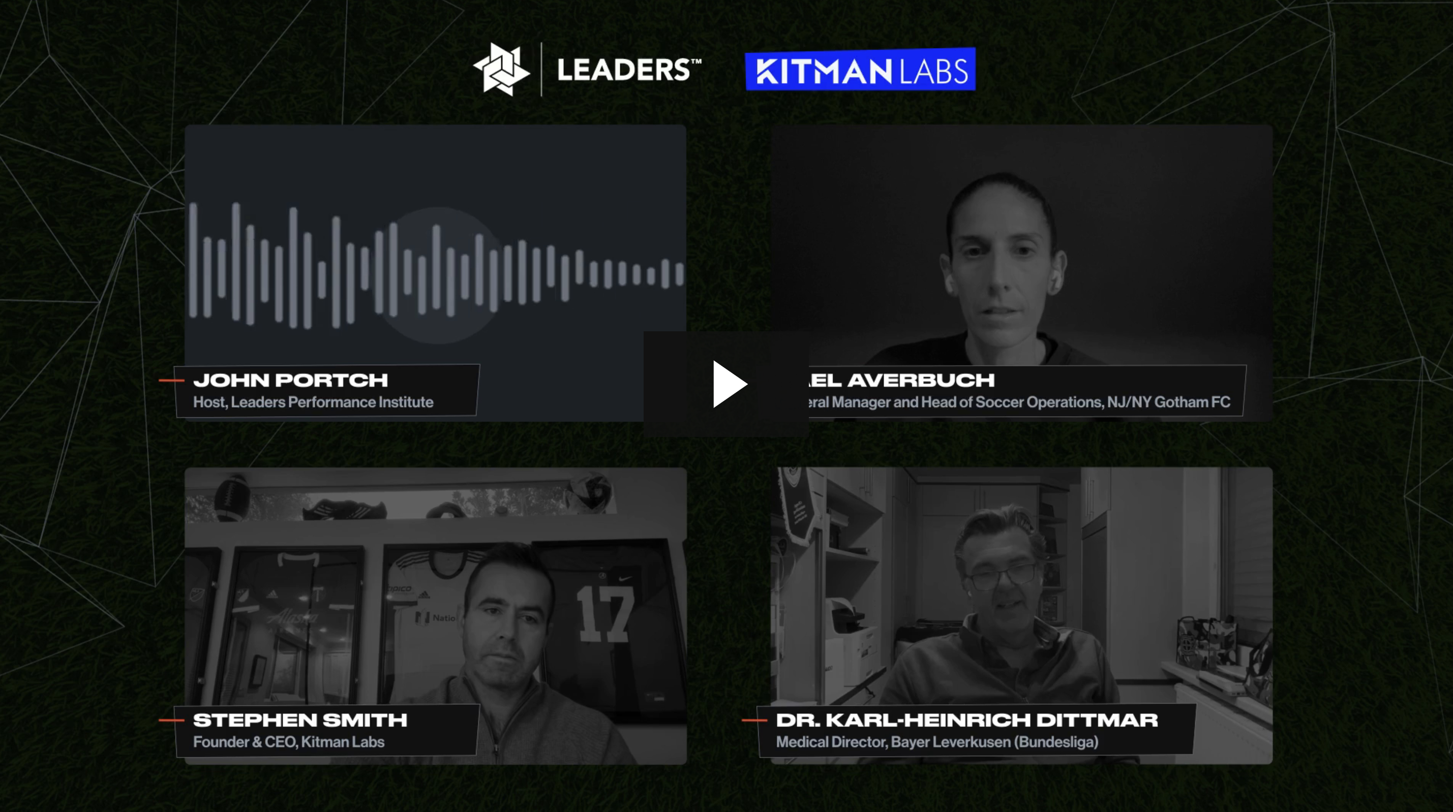
Crafting a Data-Led Strategy to Victory
Watch part three of the Leaders Performance Institute Podcast Series, where industry leaders discuss their holistic approach to data and analytics to drive success across all stakeholders, departments and disciplines.